Typefaces:
1) Serif - Commonly used on newspaper headlines to create a serious mood.
 |
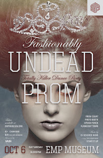
| On this magazine cover "Undead Prom" is wrtitten in "United Serif" which stands out well and is easy to read. The small flicks on the edges of the letters give a more formal effect. |
 |
In this image, "The Force Awakens" is written in 'ITC Serif Gothic' which is sharp and easy to read. This was image was created as part of a poster in the film industry. |
2) Sans Serif - More relaxed and simpler than Serif fonts.
In this example Sans Serif fontface Helvetica is used for product titles, because it is very easy to read and understand, as it isn't over-the top like a display font.
This example is taken from a website called Red Antler, who write all of their headings and subtitles in either Uni Sans or Nimbus Sans. Like most other Sans Serif fontfaces, these fonts are also easy to read, and are not only ideal to be used for titles, but can also be used in longer pieces of writing without being difficult to read.
3) Script - Script typefaces are usually based on the varied and fluid strokes created by hand writing.
Here, the shop sign above the cafe-bar has been written in a script font called "Flemish Script." Although they can be difficult to read, script fontfaces can sometimes be ideal for titles and headings to give a more elegent effect.
This is a much simplar example of a script font. Here the font "Me Mimas" has been used on the front cover of a book. This works well because you can tell that it is based on a hand-written script, but it is still easy to read and can be clearly understood.
4) Display - Display typefaces are designed to be easy to read in short amounts, and are usually used for logos, etc.
This is a good example of a display font because although it is clear that the main text reads "welcome", it would be very difficult to continue reading a large amount of text in this font. The font used here is called "Ano", which is a rather simplistic font, but still creates a more interesting look because of the way that certain letters are shaped. Here it is being used on the webpage for a Fashion company, so I think that this font would have been chosen in order to catch your eye and draew your attention to their website.
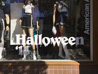
This display font called "Belwe" is also being used in the fashion industry. It's used here as part of a shop window display for a large fashion company called American Apparel. I like this font because it is very eye catching and grabs your attention, but it is still easy to read in small doses.
Examples of Fontfaces in the real world (my images):
Display:
Both of these examples I found of Sans Serif font faces in the town center are very simplistic in the way that each letter is formed. This makes them very clear easy to read from up-close and far away.
This display font was used on a shop sign in order to catch the eye of potentiol customers.The bright colours and smooth shaped letters indicate that it's target audience is young children, as this font is designed to have more of a fun element rather than be serious.
This display font has very similar characteristics to the one used in the image above. Rather than on a shop sign, I found this example on a christmas themed gift bag in a shop. Again, this display font is supposed to be eye catching and playful, but still readable in small doses.
Script:
Both these examples of Script font faces were found on shop signs in the town center. Based on hand-written writing, these fonts are eye-catching and elegent, but can still easily be read in small amounts as they are very large.
Serif:
The font used on this shop sign that says "Diamond Merchant" is a good example of s Serif fontface. The small flicks and the straight edges give a serious tone to the writing, and make it clear and easy to read.
The font used on this shop sign that says is also an example of a serif font. However, the letters in this font have rounder edges, with create a softer and more friendly effect compared to most other Serif font faces.
Sans Serif:


No comments:
Post a Comment