Monday, 18 January 2016

Unit 1 Evaluation

Evaluation

This project helped me to develop both my photo taking skills and my Adobe Illustrator skills. I feel as though my best work was from when I had to take photographs in an urban environment whilst using the Rule of Thirds to create a more interesting composition, as it allowed me to be creative in finding subject matter for my photographs whilst still working under a theme. I struggled with taking photos of Urban Juxtaposition as I had a limited time frame, and it was very difficult to find subject matter that really captured the idea of juxtaposition in an urban environment. I found that the work based on different types of font-faces and analysing where and why they are used in the real world was very interesting, and helped me to create a better final piece. I also enjoyed learning about photo composition and The Rule of Thirds, as it will help me to take better Photographs in the future. 

My Final Piece: 


For this unit of work, I was asked to create a poster, using one or more of my own images for a Photography exhibition based around Urban Juxtaposition in an Art Gallery. This is my final poster design for this project, influenced by my thumb nail sketches. 
I chose to use this particular image for my poster because I think that it shows an excellent example of Urban Juxtaposition, which gives you a better idea of what the exhibition is going to be about. This is because you don't usually expect to see plants and other forms of nature growing so well and freely in such an urban environment surrounded by steel and concrete. The image I used also works well as part of a poster due to the colours and composition. The bold, bright flower stands out really well against the darker and colder colours of the large building behind it, which easily catches the eye of the viewer. The fact that the flower in the foreground of the photograph is so central, as I used the Rule of Thirds, also helps to catch the eye of the viewer. I decided to keep the White text against a Black background so that it stands out well, and is easy to read. If I had decided to write the text directly over the photograph it might have been difficult to read because of the different colours and tones in the image. I decided to keep the description in the black box a-long with the rest of the infomation that you would have to read. I originally tired it in the top left corner of the poster on the image in a Black font, but I felt that there was too much of an empty gap at the bottom of the poster in the Black box. I added a thin Black border around the edge of the Photograph in order to make the Black text bar at the bottom look more like it belonged there, and to make the overall poster pop, and so that it would stand out well against whatever surface the poster is put on. I knew that I wanted to make the main title stand out well, so I used a large Font size and decided to place it in the centre of the image. The problem I had with this was that I couldn't find a colour that stood out well across the whole photograph. To fix this I decided to use Photoshop to create a clipping mask with the text I wanted over the image, so that the text was fully see-through inside a slightly transparent box. 

If I was to do this project again, when taking my Urban Juxtaposition photographs and Urban photographs using the Rule of Thirds, I would ensure that I went into more than one town, and maybe visit a large city so that I would have a wider variety of subject matter to photograph. I'd like to take photos like this again in a large city as I would have lots of challenges and obstacles such as people getting in the way, and light being blocked my buildings. Larger buildings in large city centres may also make for a more interesting composition. 

Thumb Nail Sketches

These are the thumb nail sketches I drew when I was planning the composition of my poster


Thursday, 29 October 2015

Exhibition Posters

Examples of Exhibiton photos that use photography:


What caught my eye about this exhibition poster is the simplicity of the layout, and the use of negative space around the central image  and the small amounts of texts. The use of dull colour in negative space works well in contrast to the bright, vibrant colour of the water in the photograph being used, as it draws your attention directly to the main image. I also enjoy the way that the photograph used in this poster has been cropped into a diamond shape, which makes for a more interesting composition. By using a simple San Serif text against a plain background, the designer has made the text very easy to look at and read.


Unlike the previous poster, the background is actually made up of a photographic rather than placing a photograph on a plain background and creating negative space. This technique works really well, as it makes the poster stand out well and catch the viewer's eye. By using a red text box over the top of a Black and White image, the artist has again been able to create a very eye-catching poster, as the red text box stands out so well against the dull colours of the image in the background. 


This poster is very similar to the one above. What particularly caught my eye about this one was the photograph used as the background, because it is very bright, colourful and vibrant, which creates a rather positive atmosphere for the viewer. The text box used in this poster is a much darker colour than the red one used in the previous example, which doesn't stand out as well, but still makes the text very easy to read and understand. The photograph used is also very soft, as the it is only the carousel in the background that has been left in sharp focus, compared to the out  of focus tree and lights on the right hand side of the foreground. The rule of thirds could easily be applied to this image, as the the text box is on the left of the poster, and the out of focus part of the image is on the right, whilst the focused part of the image is directly in the centre of the poster. 


Like the first example, this poster uses a lot of negative space. The image in question has been cut out like a silhouette and stuck against a plain white background, which makes it stand out more. The bright colours used in the main photograph are also very eye-catching and bright in contrast to the dull background. The use of this dull background however makes the black text above the image very easy to read. The artist seems to have used a very central composition in this image, which means drives the viewer's attention directly down the centre of the poster, to read/look at each item in turn. 


This poster caught my eye because the artist has actually used multiple photographs in their design, unlike the other examples that I have looked at, which only use one main image. By using dark images, all with similar tones and colours, against a plain white background, the artist has been able to make each individual image stand out against the page. The composition of this poster is also rather eye-catching, as the use of a grid makes the viewer look at each image in turn without losing interest, so they focus all of their attention on each image. 

Monday, 19 October 2015

Typography

Typefaces:

1) Serif - Commonly used on newspaper headlines to create a serious mood.

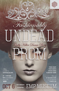
On this magazine cover "Undead Prom" is wrtitten in "United Serif" which stands out well and is easy to read. The small flicks on the edges of the letters give a more formal effect. 

In this image, "The Force Awakens" is written in 'ITC Serif Gothic' which is sharp and easy to read. This was image was created as part of a poster in the film industry. 

2) Sans Serif - More relaxed and simpler than Serif fonts. 


In this example Sans Serif fontface Helvetica is used for product titles, because it is very easy to read and understand, as it isn't over-the top like a display font. 


This example is taken from a website called Red Antler, who write all of their headings and subtitles in either Uni Sans or Nimbus Sans. Like most other Sans Serif fontfaces, these fonts are also easy to read, and are not only ideal to be used for titles, but can also be used in longer pieces of writing without being difficult to read. 

3) Script - Script typefaces are usually based on the varied and fluid strokes created by hand writing.


Here, the shop sign above the cafe-bar has been written in a script font called "Flemish Script." Although they can be difficult to read, script fontfaces can sometimes be ideal for titles and headings to give a more elegent effect.

This is a much simplar example of a script font. Here the font "Me Mimas" has been used on the front cover of a book. This works well because you can tell that it is based on a hand-written script, but it is still easy to read and can be clearly understood. 

4) Display - Display typefaces are designed to be easy to read in short amounts, and are usually used for logos, etc. 

This is a good example of a display font because although it is clear that the main text reads "welcome", it would be very difficult to continue reading a large amount of text in this font. The font used here is called "Ano", which is a rather simplistic font, but still creates a more interesting look because of the way that certain letters are shaped. Here it is being used on the webpage for a Fashion company, so I think that this font would have been chosen in order to catch your eye and draew your attention to their website. 


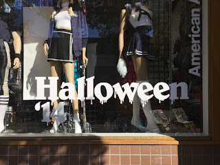
This display font called "Belwe" is also being used in the fashion industry. It's used here as part of a shop window display for a large fashion company called American Apparel. I like this font because it is very eye catching and grabs your attention, but it is still easy to read in small doses.


Examples of Fontfaces in the real world (my images):

Display:
This display font was used on a shop sign in order to catch the eye of potentiol customers.The bright colours and smooth shaped letters indicate that it's target audience is young children, as this font is designed to have more of a fun element rather than be serious. 


This display font has very similar characteristics to the one used in the image above. Rather than on a shop sign, I found this example on a christmas themed gift bag in a shop. Again, this display font is supposed to be eye catching and playful, but still readable in small doses.


Script:


Both these examples of Script font faces were found on shop signs in the town center. Based on hand-written writing, these fonts are eye-catching and elegent, but can still easily be read in small amounts as they are very large. 

Serif:


The font used on this shop sign that says "Diamond Merchant" is a good example of s Serif fontface. The small flicks and the straight edges give a serious tone to the writing, and make it clear and easy to read. 


The font used on this shop sign that says is also an example of a serif font. However, the letters in this font have rounder edges, with create a softer and more friendly effect compared to most other Serif font faces.

Sans Serif:


Both of these examples I found of Sans Serif font faces in the town center are very simplistic in the way that each letter is formed. This makes them very clear easy to read from up-close and far away.

Urban Juxtaposition

The definition of juxtaposition:
"The fact of two things being seen or placed close together with contrasting effect."


Example images:


The contrast in this image is between the the flowers and plants in the foreground and the tall buildings of the city in the background, which have been left partially out of focus. This  create a juxtaposition because you do not notrammly expect to see plants and nature in an urban man-made environment. 


The contrast in this image comes from the main subjects being photographed, and their location. The main subjects in this image are the two people who look as though they
have just been to a wedding or gotten married, who have been left in focus using a horizontal tilt shift. Usually photos for occasions like this are taken in more positive environments, rather than what appears to be in an urban back street covered in graffiti. This creates a juxtaposition. 


My own images:


The contrast in this image is between the the flower in the foreground and the large city like building and the carpark that have been left out of focus in the background. This  create a juxtaposition because you do not normally expect to see plants and nature in an urban man-made environment. I used a high aperture when taking this image which resulted in maximum natural light in the image, and left the urban surroundings in the background out of focus. Since the main subject in this image (the flower in the center) is the only part of the image that is in sharp focus it draws your attention directly to it. I also like the contrast between the light tones and bright colours of the flower and other plants in foreground compared to the darker tones and shadows of the building behind it. The rule of thirds could easily be applied to this image as the main subject is directly in the centre of the photo. 


The main subject in this image is the wicker sculpture of a person rowing in a small boat in the center of the image. What really caught my eye about this was that it had been placed in Wigan town center in between large office buildings and building work in the background where there isn't much nature and members of the public don't usually spend much time. If I was to take this image again I would make sure that I used a higher aperture so that the image was brighter, because any direct sunlight was being blocked out by the tall buildings. 


I like the way that this particular image turned out because there is plenty of natural light and a high contrast which makes the colours very bright and vibrant. Juxtaposition is created here because in this one small section of the busy town center there are lots of brightly coloured, lively flowers and other plants, as well as grass-land, which is something you wouldn't usually expect in a busy town center. The rule of thirds could easily be applied to the image, as the large metal statue in the foreground is in the right-hand side of the photo, and the large modern building in the background goes across the image horizontally. 


This image was taken in a location very close to the image above, and has the same sort of juxtaposition, as someone has made a small urban garden outside of this large modern busy building that is bursting with life and colour. There is a huge contrast in colour and tone between the vibrant, green trees and plants in the foreground and the cold and dull colours of the metal building and the stone floors. 


The main subject in the image on the left is the boy stood directly in the center of the image who has been left in sharp focus, similar to the image on right. I like the contrast in subjects in these images as they create a strong juxtaposition, because you would not expect to see someone dressed formally in a dingy dark ally/back street covered in graffiti. Keeping the image on the left in Black and White helps to create a more serious mood, which matches the facial expression of the boy being photographed. 


I took this image in Krakow (Poland) which is a popular and very busy city. The juxtaposition in this image is created by the trail of rose petals that was left by somebody, as this is something that you wouldn't usually see in such a busy urban enviroment. There is a strong contrast in colour in this particular image because of the way that the vibrant, bright and warm colours of the flower petals stand out so well against against the dull cold tones of the pavement. 


I took this image in outside of a college in Liverpool city center, and thought that it represented urban juxtaposition, because you would not expect someone to leave a broken bike chained up to a bike rack. I was fortunate with the weather on this particular day which meant that I had plenty of natural light in my image.


I took this photo in Harrogate town center, and believe that it shows urban juxtaposition, because you would not usually expect to see a smiley face with googlie eyes on the light of a zebra crossing. I like the composition in this photo because of the way the large building in the background stands out so well against the dull sky above, which creates a negative space. I also like the way that the shape of the building curves round with the road in front of it, and almost guides your eyes down the road.


This image shows a good example of urban juxtaposition, because you wouldn't expect to see a broken hoover abandoned on a street. I like the way the lighting has given this image a softer, old-fashioned look to the overall image, which matches the content of the photo. I used this image as part of a project in my old college, which is why it has been photoshopped into a polaroid frame. 

Thursday, 24 September 2015

The Rule of Thirds.

Rule of Thirds Definition:

"In the rule of thirds, photos are divided into thirds with two imaginary lines vertically and two lines horizontally making three columns, three rows, and nine sections in the images. Important compositional elements and leading lines are placed on or near the imaginary lines and where the lines intersect."

I found these three examples of photographs from Urban Cities that each use the rule of thirds:


The main subject in this image is the tall building on the left that has been left in much sharper focus than the other buildings and it's other surroundings. It also looks like the photographer has used a long exposure to make the clouds above the building look like they're moving, which also makes the building stand out more. You can see on the grid that this image follows the rule of thirds because  the center of the front of the building follows the rule of thirds as it follows the first vertical line on the left, and because the bottom of the building is close to the bottom horizontal line. 


The main subject in this image is the sun setting in-between the two rows of tall buildings. You can clearly see that the rule of thirds has been used here because the sun is along the bottom horizontal line, and the is directly in the middle of the two vertical lines. Having the main subject so central and in-between other subjects (the buildings) makes you focus on exactly what the photographer wants you to focus on. 


In this image the main subject (the sky scraper) has been positioned more towards the left on the image rather than directly in the center, and left in focus where as the skyline in the background has been left slightly out of focus, which is done to draw your attention directly to the building in the foreground. 

My own images using the rule of thirds:


The main focal point in this image is the tower on the right which has been left in sharp focus, compared to the Blue part of the building in the foreground which has been left out of focus. I like the way that the dark colours of the main focal point stand out so well against the the lighter colours of the sky behind it, which makes it stand out more. I used a high contrast in this image to help show more colours and details throughout the image. The rule of thirds applies to this image, as the main focal point in only on the right hand side of the grid. 


The main subject in this image is the open door way that has been broken into, in the centre of the image. The amount of natural light in this image allows you to see plenty of detail in the brick work and rubble surrounding door way. The high contrast in this image allows you to see the vibrancy and variation in colour on the faded brickwork of the building, but still keeps the doorway and the inside of the building looking dark and mysterious, which creates a negative mood. The rule of thirds applies to this image, as the main focal point (the open doorway) is in the very centre of the image. 


The main subject in this image is the pay phone attached to the wall. I decided to make this particular image Black and White and use a high contrast so that you can clearly see a variation in tones and a lot of detail on the wall that the pay phone is attached to. The rule of thirds apply to this image as the main focus point is horizontally central, but is also more towards the right hand side of the image, which creates a more interesting composition.


The main focal point of this photo is the old-fashioned lamp on the side of the building. I like how the natural light in this image allows you to see the high contrast between the Black Lamp, and the White Wall which it's attached to, as it helps the main focal point to stand out more. It can be argued that the rule of thirds does apply to this image, as i tried to ensure that the lamp would be along the vertical line on the right hand side of the grid, however when I later placed a 3x3 grid over the image, I now think that i left the main focal point too central. 


I think that this image was a success as I was able to keep the main focal point (the statue of a head) very central. The high exposure has meant that you can't see any colour in the sky behind the statue, which creates a high contrast and helps it stand out more. However, I think I have over exposed the whole image, as it is difficult to see any detail and some of the colours look faded and less vibrant than they should. 


The main focal point of this photo is the building along the right hand side. The rule of thirds can easily be applied to this image, as the main subject is on the right hand side of the image, and as you can see from the grid, the tallest part of the building is along the vertical line o the right hand side. There is a high contrast in this image between the bright vibrant colours of the brick work of the building on the right, and the darker colours of the trees and street light on the left. I also like the contrast between the main focal point and the sky in the background, as it helps is stand out more.


I don't think that this particular image was as successful as the other photos I took as it isn't very well exposed and isn't very well focused. However, the rule of thirds could be applied to this photo, as the negative space created by the dull sky in between the two buildings is in the centre of the image. 


This image works really well, as the main focal point is the only subject is the building, so there are no other distractions within the image to draw your attention away from it. The negative space around the building has been created by an over exposed sky on a dull and cloudy day. The rule of thirds can easily applied to this image as the corner of the building is in the centre of the image. 


Although this image is very dark I believe it was successful because the rule of thirds does apply. The main focal point in this image is the tall building being illuminated by spot lights. When a 3x3 grid is placed over this image you can see that the tallest tower of the building is directly along the vertical line on the left hand side. I also like the way that the centre of the building in the centre of the image is lit up so well. 


The main focal point of this final image is the large ship with the red crane attached. Unfortunately the quality of this image isn't very high, as I was unable to use my camera and had to take it on my mobile phone. However, I do like the lighting in this image, as there is a large amount of natural light which allows you too see the main subject clearly. The rule of thirds can be applied to this image as the red horizontal framework runs across the top section of the image.